2020 was a tumultuous year for all of us. For me as a maker and a founder it also meant trouble. Some contracts fell through the cracks, the curfew, a loss of connection with some people and an overall degraded state of mind led to me not focusing on the platform.
But that changed back in December 2020 when I picked myself back up again. I'd like to announce some updates that I've been silently shipping into the platform for the past three months.
Job Applications
This is, probably, what distinguishes WeRemote.EU from other remote job websites.
The goal was to not have WeRemote.eu be Yet Another Remote Jobs Board™️.
In-app job applications gives me the ability to call WeRemote.EU a remote hiring platform. It is this feature, along with more tooling that's currently being built, that will ultimately make the platform worth spending money on.
How can you apply to a job on WeRemote.EU?
The job application process is, in essence quite simple. Part of this simplicity is due to the fact that I'm building the platform by myself and I only have this much time and resources to dedicate to it.
So to apply to a job you must:
- Log in to your candidate account — Or sign up if you don't have an account, yet
- Find a job that matches your experience and requirements (see how)
- You read the description (this is important!)
- You click on the "Apply" button and follow the steps
Once you finish applying, the employer will receive an email about your candidacy. They can then validate your profile and/or engage with you in a conversation.
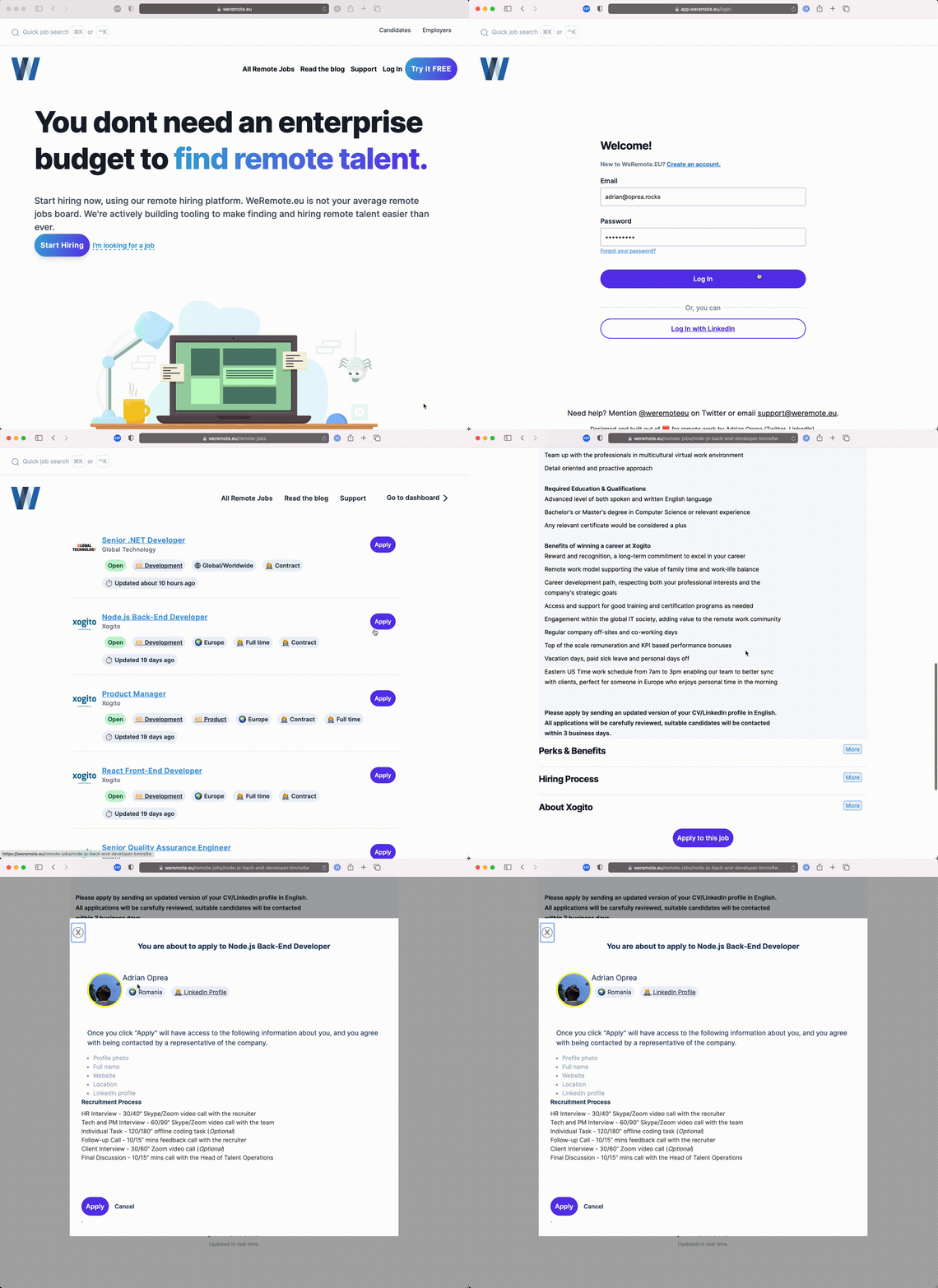
Where do discussions with employers happen?
Conversations about job applications happen inside the application through a comment-like system. This is my way of encoding a transparent hiring process that doesn't suck, into the platform.
Due to this, I decided to add extra sections to the job details page. These allow employers to describe the company and their hiring process. This way, as a candidate, you will always know where you're at in the recruiting process and what's next.
**For candidates, the best thing about in-platform job applications, is that you no longer have to fill endless forms! **
Currently, to apply to five jobs on any job board, you must visit five different websites and fill five different forms. One asks for a PDF version of your CV, the other wants an Europass-formatted Word document. And don't forget the letter of intent (or cover letter).
Not on WeRemote.EU!
Of course, candidate profiles would definitely use more detailed information. I'm getting there. But right now I'm ok piggybacking on LinkedIn to provide more information via thier profiles.
What's in it for you if you're an employer?
There are reasons for you to be happy, too. You no longer have to post your job on some weird website simply to get a link you can paste in all these pesky job boards. Nor do you have to keep a separate excel file to sync all the sites where you have your jobs listed.
Fill in the details of your job, either by posting it by hand, or via bulk-import and publish everything in no time.
Improved UI
I remember in 2011 when someone first mentioned Don't make me think, by Steve Krug to me. Not because the book was so impactful on me, although it was, but because within the context of that discussion I learned who Dieter Rams was.
So with this new UI changes I decided to apply Less, but better, Dieter Rams' design principle, to WeRemote.EU, and cut down on anything superfluous.
Better designed forms
Remember those bulky forms we had a couple of months ago? No? Good! I hope people forget the humongous input fields and buttons, the color mismatch and all the UI/UX mistakes I as a non-designer made.
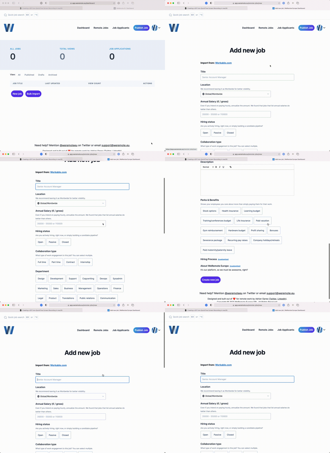
Better (prettier?) colors
"... cut down on anything superfluous" — except colors
One place I could not keep away from was the colors part. I was looking to change those bland colors with something more pleasant, and so I went over to gradienthunt.com and started playing with some color combinations.
I finally reached this beautiful purple-themed gradient which I am currently in love with. I hope you'll like it too.
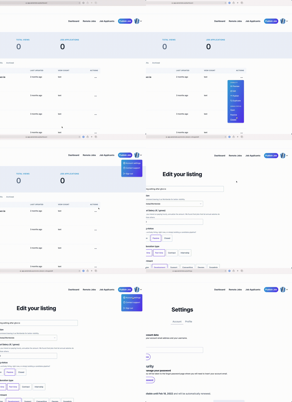
Friendlier menus
I'm not saying the previous menus were ugly or unusable, but a drip of color, some fresh icons and a bit more spacing can work wonders. Even the most boring of components, such as dropdown menus.
Job Requests
I know how frustrating it is to browse job sites and not find anything that matches your skillset, desired benefits or other criteria.
The reality is that you won't always find the job you want. But that doesn't mean you should give up searching or give up on the website. Even better if the site allows you to ask for what you want and need.
I decided to flip it, and not give up on the people who can't find the job they want on WeRemote.EU.
And this is how the Job Requests feature was born.
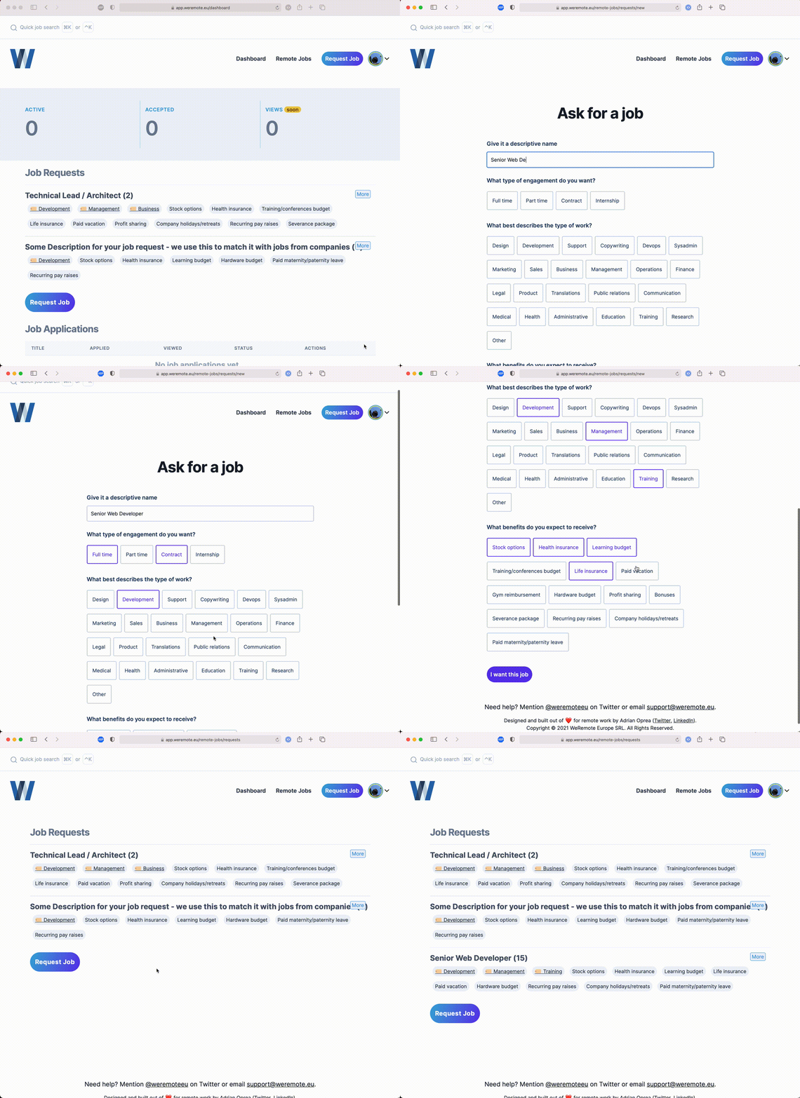
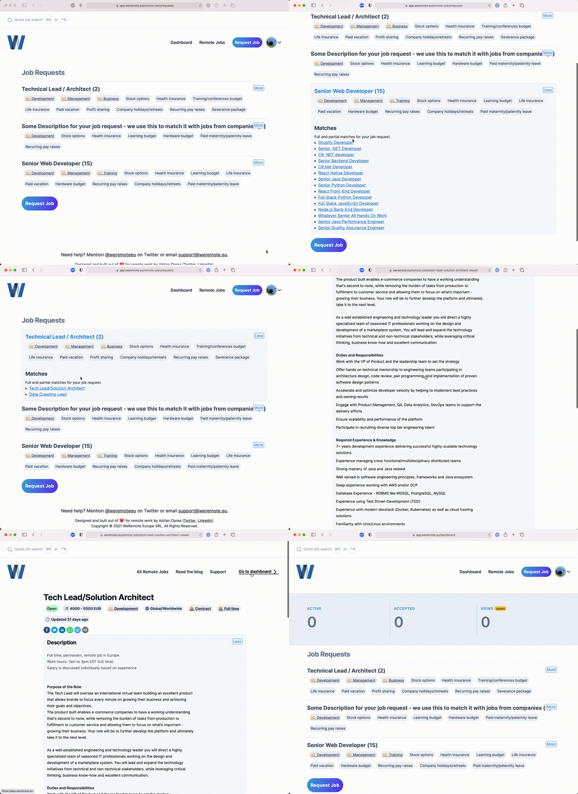
In essence, a Job Request is what you would expect it to be: a reverse-job-posting.
It's candidates asking for jobs, and a portal through which employers can search and "fill" that need. Currently the employer portal does not exist, but there are still good news over there: I as the CEO of the company will be using these job requests starting next week, to get in touch with companies and bring their jobs to the platform.
Besides being able to get in front of companies. Job requests act as filters/watchers for jobs that match your criteria. Each job request has a number next to its title, and whenever expanded, if there are jobs matching the request, they're displayed below.
Search-from-anywhere
I've been an Apple user since 2007. Growing up dirt-poor in Eastern Europe, of course I could not afford buying a Mac, so I had a Hackintosh until 2011 when I bought my first MacBook Pro.
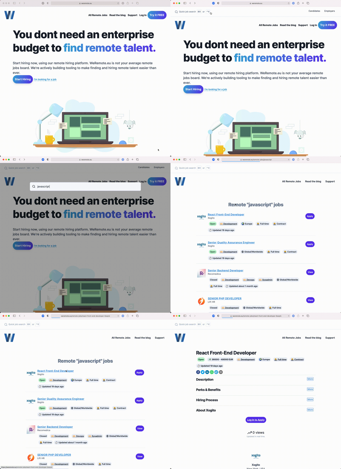
One of the macOS features I abuse every day is Spotlight. I love the speed it gives me when dealing with trivial tasks. I rarely use the mouse/trackpad to search, to open files and folders or to find the definition of a word 😹.
So it's worth mentioning that Spotlight was my inspiration for moving the job search functionality from the jobs / search pages into a site-wide-accessible feature.
With a simple keyboard shortcut, ⌘+k(command+k) on macOS or ⌃+k(ctrl+k) on Windows, you can toggle the job search from anywhere.
Future plans — jump to anything
The next step for this feature is to transform into a jump-to-anything kind of functionality. Employers will then easily publish and edit listings and accept or reject job applications simply by typing a couple of commands.
For candidates, they will be able to add jobs to a bucket list (wishlist), apply to jobs, or create job requests without touching the mouse or the trackpad.
Google Auth
I've been pondering this for a while and decided to give it a shot. Currently, the application is under review from Google. The privacy policy is on its way so I expect to have Google login/sign-up within two to three weeks.
Thankfully, I have my good friend Daniel SUCIU, who is one of the best data protection and GDPR professionals I know, working on my policies.
Until then, people can still sign up and log in using regular email/password combos or by using LinkedIn.
Bulk Jobs Import
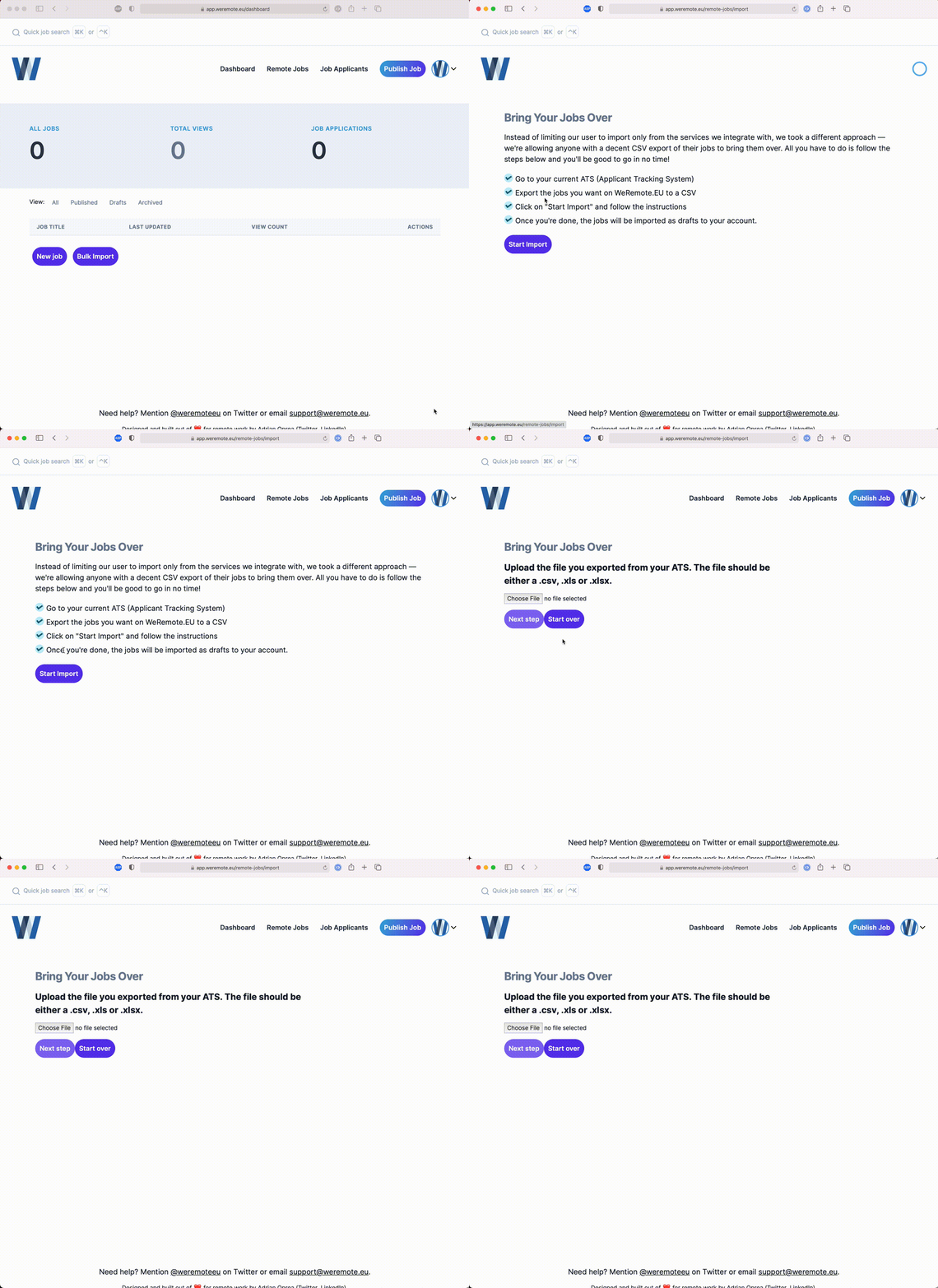
This is so simple that it doesn't need any complex explanation on my part.
As an employer, you can export an excel with jobs from your current ATS / jobs platform and go through the bulk jobs import process in just a couple of clicks.
Status Page
To top it off, I put up a small status page so people can check and signal outages.
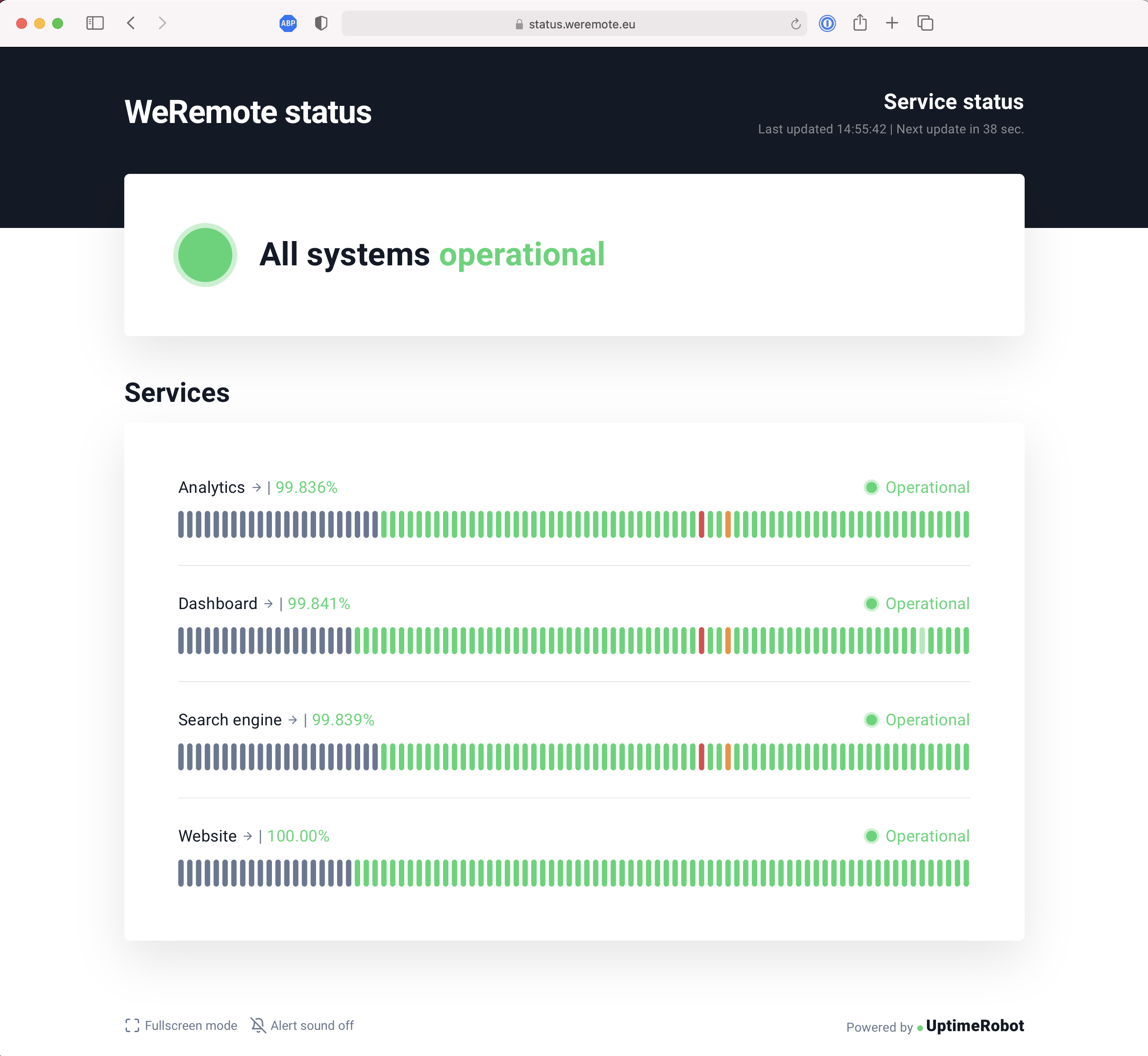
My hope is that it will always stay 🟢 🟢 🟢
What else is cooking?
I wanted to list here all the new features I want to push into the platform. But the best way to know what to add to the platform is to talk to users and not just make a list of nice-to-haves that have been around in my brain for a while.
So please email [email protected] if you have a feature suggestion.
Thank you!
